

Pies, Pies, Pies (1961)
The exhibition Wayne Thiebaud 100: Painting, Prints and Drawings, is simply glorious. I saw it at the Brandywine River Museum of Art, the fifth and final venue of a five-museum tour.
Wayne Thiebaud is one of my most favorite American artists; he died on Christmas Day 2021 at the age of 101. His paintings are beautiful, inventive, chromatically vivid, expressive, humorous, melancholic and so much more. Most of all, they are stunningly visual. Pick a Thiebaud, any Thiebaud. Now park yourself in front of it and look at it. Just look. Let your eyes roam hither and yon, up, down and sideways, wherever they happen to go. Notice whatever you notice. If you allow yourself to really look, there is no limit to what you will see. And you won’t have to “know” anything about the work in order to see it.
The Purpose of Labels
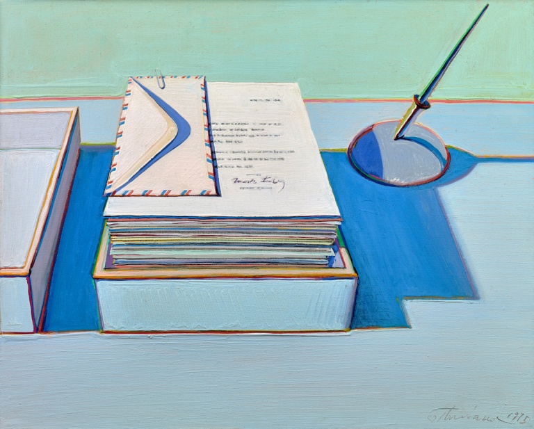
Office Still Life, 1975
There were a number of text panels throughout the exhibition; many of the works had extended labels. I read labels. Compulsively. They can be a source of helpful and fascinating titbits. If they are any good. Many museums avoid lengthy labels. They stick to the facts—artist, title, date, sometimes more. Extended labels—which require a larger card—are sometimes seen as a distraction, both visual and aesthetic. A good text directs the viewer into both the work and their own thoughts. These didn’t do that. Not for me.
The Good Label
A good label anticipates what ordinary visitors—people of any age with no significant background in art history—might ask. Different viewers, of course, will ask different questions. One can’t anticipate them all, let alone address each one. There are, however, predictable areas those question fall into:
- What am I looking at and what is going on?
- What are these things I cannot easily recognize?
- Is there a story and how does the artist tell that story?
- Why did the artist use their materials the way they did?
Betty Jean Thiebaud and Book, 1965-69
The label for Betty Jean Thiebaud and Book spent about half its words repeating general information already provided in other exhibition text. The few remaining words weren’t especially interesting.

Tapestry Skirt, 1976/1982/1983/2003
For instance, there’s that book. It’s pretty obtrusive in terms of the composition. There is, however, no mention of the book. Scott A. Shields (Associate Director and Chief Curator, Crocker Art Museum) says in Smithsonian Magazine, “…the book wasn’t originally there. Thiebaud changes paintings; some can have as many as five different dates. He tweaks them over a period even of a decade.”
I noticed also that the dates for Tapestry Skirt are 1976/1982/1983/2003. That’s a span of twenty-seven years. Or more. A lot of time. Potentially a lot of changes. Should that be important to me?
What would I have written?
I would have started with the obvious: “What is that book, why is it there and what are the two pictures it is open to?”
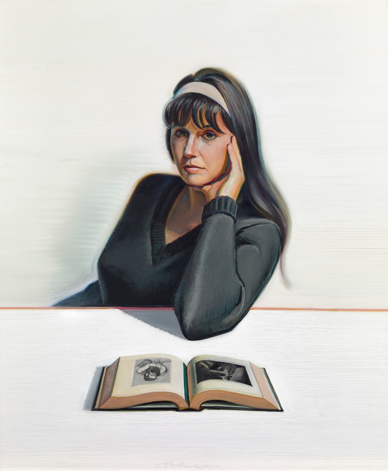
Betty Jean and Book
Because I am an art historian, I wonder if the one on the left (facing the painting) is a drawing by Edgar Degas (1834-1917), or possibly Edouard Manet (1832-1883). On the left I can just make out a boy in a brimmed hat, sitting on the ground, elbows on knees. George Seurat (1859-1891)? Maybe Jean-François Millet (1814-1875).
Identifying the illustrations, however, might be less important than looking at them.
What is it that Thiebaud likes so much about these drawings? And what is the connection that he sees between them and the figure of his wife, slouching in a chair, resting her elbow on a table? Is Betty Jean even looking at those pictures or are they something that Wayne is thinking about as he poses his wife and begins to paint?
As I peer into the painting, I start to get the aesthetic chills. A real case of the willies.
There’s More
Look at the shadows around that book, the one cast on the table and the teal-blue one in the gutter at the center with a yellow-gold glow down the gutter opposite. Oooh! Near-complements as colors go. The gutter leads me to Betty Jean’s elbow and suddenly I notice the earthy orange line that demarcates the table edge, one side of the canvas to another. Did I notice that first or did I notice the shadow behind her that seems more like an aura? Now I am looking at the way blue and orange are used as shadows and highlights to detail her face, delineate her hand, form the edge of her black-clad figure.
Then I think about those long, luscious, horizontal strokes of pure white that constitute the table. The creamier white of the background has the same texture. I am fascinated how Betty Jean’s sturdy bulk fits in the apparently paper-thin space that separates table and wall. If I go back to art history, I might think about Paul Cézanne (1839-1906) and his manipulations of volume. Perhaps Henri Matisse (1869-1954). I remember that in addition to being an inveterate museum goer, Thiebaud taught art history, all kinds of art history, for more than a decade. He loved art. He looked at art and the world at large.
Questioning Authority
There may or may not be answers to my questions. The Smithsonian Magazine article–presumably the description comes from Scott A. Shields (Associate Director and Chief Curator, Crocker Art Museum)–claims “In Betty Jean Thiebaud and Book, Thiebaud’s second wife leans on one elbow, seemingly bored by the art book in front of her.”
Is she “bored,” though? And Shields says the book wasn’t originally there. Maybe Betty Jean is looking at nothing at all.
So go on, Mr. Shields. Why did Thiebaud add the book and why oh why did he add it open to those particular images? Surely you must have some thoughts on this matter.
The Last Word
I’ll give Wayne Thiebaud the last word.
You want to look carefully at paintings so you can really get what they’re about, Unfortunately, because of the museum structure and so on, people have little time to look, often just a few seconds and they move on, where people who love paintings will spend as long as hours looking at a single painting and it unfolds like film, like a motion picture.
Yes, indeed. “You want to look carefully at paintings so you can really get what they’re about.” That goes for the curators and label writers, too.