
Professor Henry Higgins—or the voice of Rex Harrison—is stuck in my brain. It is not so much that I lament English ill-organized and -enunciated in ordinary communications. It is more a matter of abuse heaped on words and syntax by whoever is writing those damned labels for modern art.
This is not a new whine for me; it is one of very ancient vintage. Nor is it confined to works produced from the 20th century one—although the problem is absolutely worst with creative output since about 1950. The roots of the problem reach deep into the murk and mire of beliefs about what we should learn about art, about what constitutes “authority” in the curatorial or scholarly voice, about the fact that the art world is controlled by a cabal of critics, collectors, dealers and devotees whose interests are not served by an open and intelligible discourse that just might, on occasion, call a humbug a humbug.
These thoughts never leave me. It’s just that they recently were amplified by too many visits in too few days.

Jonathan Borofsky, Hammering Man
The Museum of Contemporary Art San Diego, at its outpost in La Jolla, was ending the run of “San Diego Collects,” a lovely show that suggests that there is a lot of money in local art budgets. With only a couple of exceptions—such as the label on a Anselm Kiefer—labels rambled here and there, offering inscrutable generalities about the artists and what they purported to be doing. What struck me in particular was that absence of commentary about collecting. The show was supposed to be about collecting but no comments even touched on the acquisitive urge. Nothing about why collect, why collect modern and contemporary art, and why acquire these specific objects. No owners were quoted on the labels. No discussion was offered on larger text panels. The paintings and sculptures on display were pricey things. A Robert Motherwell was familiar; I first saw it when I had an unobstructed view of it during a dinner at the owners’ home back in the 1980. It would have been costly back then, unlikely to be an impulse purchase even for people of substantial wealth. So what attracted them to that Motherwell?
As a graduate student at Boston University in 1982, I took a course that included a preview of an exhibition and a chat with the collector (the now late) William H. Lane. Among the questions he fielded were ones about how he decided on a particular work (it had to “fit in my station wagon”) and which work, among those in the gallery, had been his first purchase (a small Franz Kline).
I always want to know the backstories; curators don’t seem to care much about backstories. Their context for art works is often historical, social, political and intellectual, but rarely personal. Curators are happy to carry on about why a piece is “important” but not why that piece is important and meaningful to the person who owns it, thinks about it, shares a life with it.

The Broad and behind it the Walt Disney Concert Hall
Eli and Edythe Broad are famous for their wealth and the way their collecting has shaped the artistic and financial trajectories of artists like Jeff Koons. Broad’s fortune comes from real estate development and insurance. He is justly famed for his philanthropic endeavors but his money, unsurprisingly, is tied unbreakably to his ego. The Broad, his museum of contemporary art on South Grand in Los Angeles, is only one art museum that bears his name. There are others at Michigan State University and UCLA.
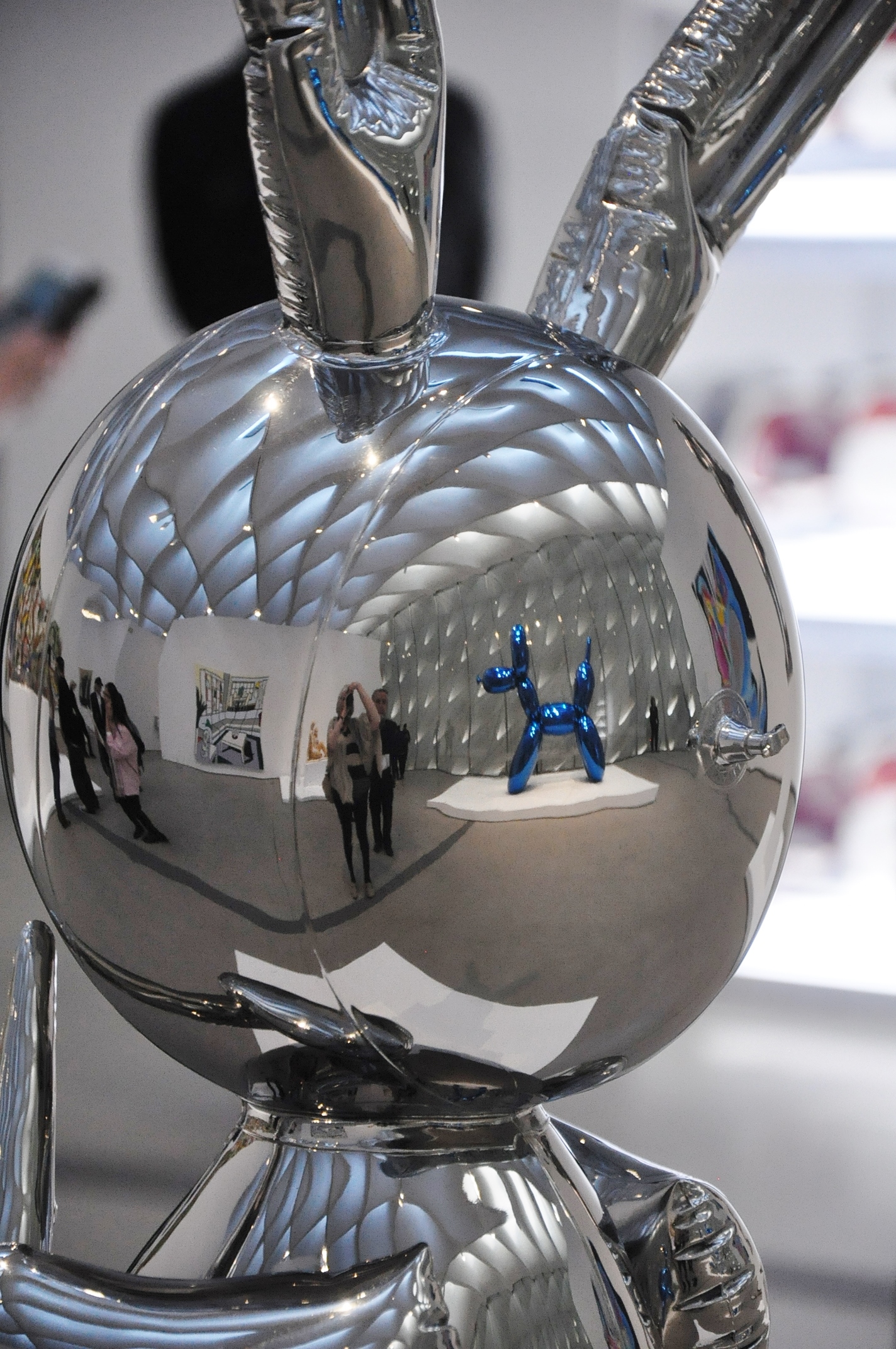
Bunny reflecting Balloon Dog and everything else
The building is a dramatic if not entirely appealing piece of architecture. The collection—at least the part that was on display, is impressive although hardly comprehensive. Quality is, as art folk say, uneven. The overall experience The Broad offers is energizing and fun—untill one starts reading the labels. If one can find the labels. These diminutive elements are distanced from the works they identify as though contact between the two would transmit cooties. Again I ran up against the inscrutable generalities. And gobbledygook. The writers (the curators?) toss around words with utter disregard for dictionary definitions and syntax, and absolute disdain for the visitor who may be looking for insights.
The last time I had such difficulty decoding art-centric prose was perhaps a decade ago when we visited DIA Beacon in New York. These labels sound like direct transcriptions of secret codes devised by wine-sodden young professionals only recently graduated from college. An additional problem is posed by curatorial affinity at The Broad for the German language. Titles of works by German artists (Anselm Kiefer, Joseph Beuys, and others) are left in the original German and not translated into English. These titles, unfortunately, are often key to understanding the works. The works of Takashi Murakami, on the other hand, are presented in English: no Japanese text of any kind.
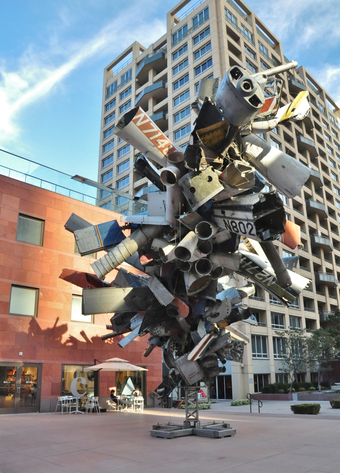
Airplane Parts at LA MOCA
How did all this make me feel? Sort of stupid, certainly on the outside looking in, and not really welcome in those aesthetic precincts.
We finished off the day at the Los Angeles Museum of Contemporary Art across the street. The exhibition “Art of Our Time” reimagines the history of modern and contemporary art through MOCA’s permanent collection. Meaty text panels provided historical and social context. Individual labels were okay, some better than others. Kudos to curator Helen Molesworth across the board.
On the other hand, isolating an entire wall’s worth of labels at one side of the hanging arrangement didn’t work so well. I simply can’t quickly memorize five, six or seven labels (artists’s names, titles of works and dates) and then apply them to the objects as I encounter them. Back to feeling not especially bright.
I get it. Curators and exhibition designers hate labels, hate the look of them, hate the way they distract from the works. They need to get over it, though. A regular review of the requirements of the Americans with Disabilities Act would certainly be in order. Text needs to be in a font large enough for people with less than perfect vision to read. Not everyone owns (and competently uses) a smart phone so saying “there’s an app for that” when it comes to exhibition interpretation just doesn’t cut it.
So why can’t the writers just learn to think? About visitors at any rate. And use dictionaries? And why do directors and board members let this kind of lazy, sloppy thinking about the art be formalized in the labels and other interpretive texts?
Do they really not know any better, or do they just not give a damn?