
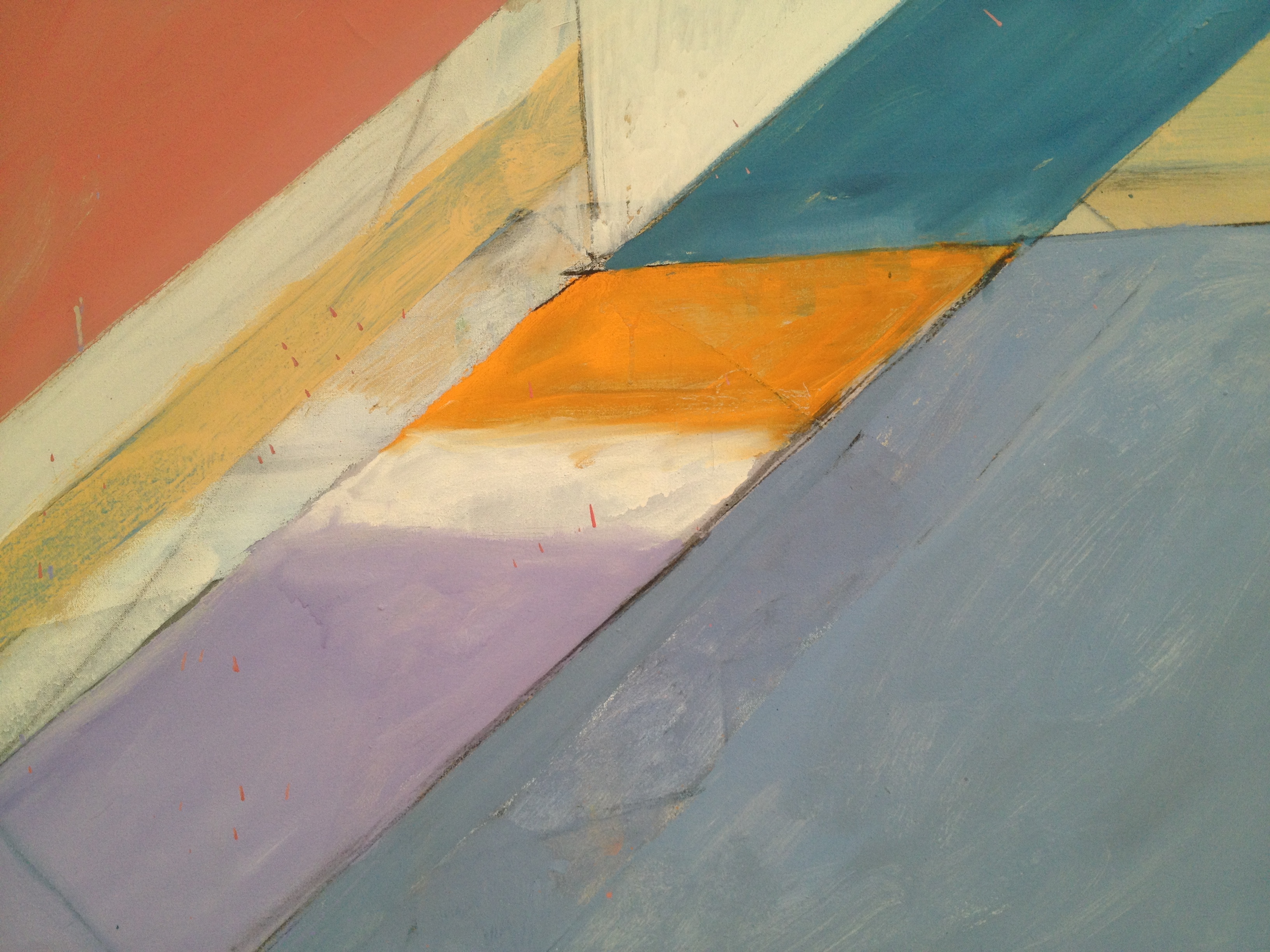
Ocean Park color
Art lives in that kind of white, crystalline light. It doesn’t just come alive; it takes on a whole new existence. Those top galleries in the “new” Yale University Art Gallery? They were a mystical symphony hall and the art a choir of angels.
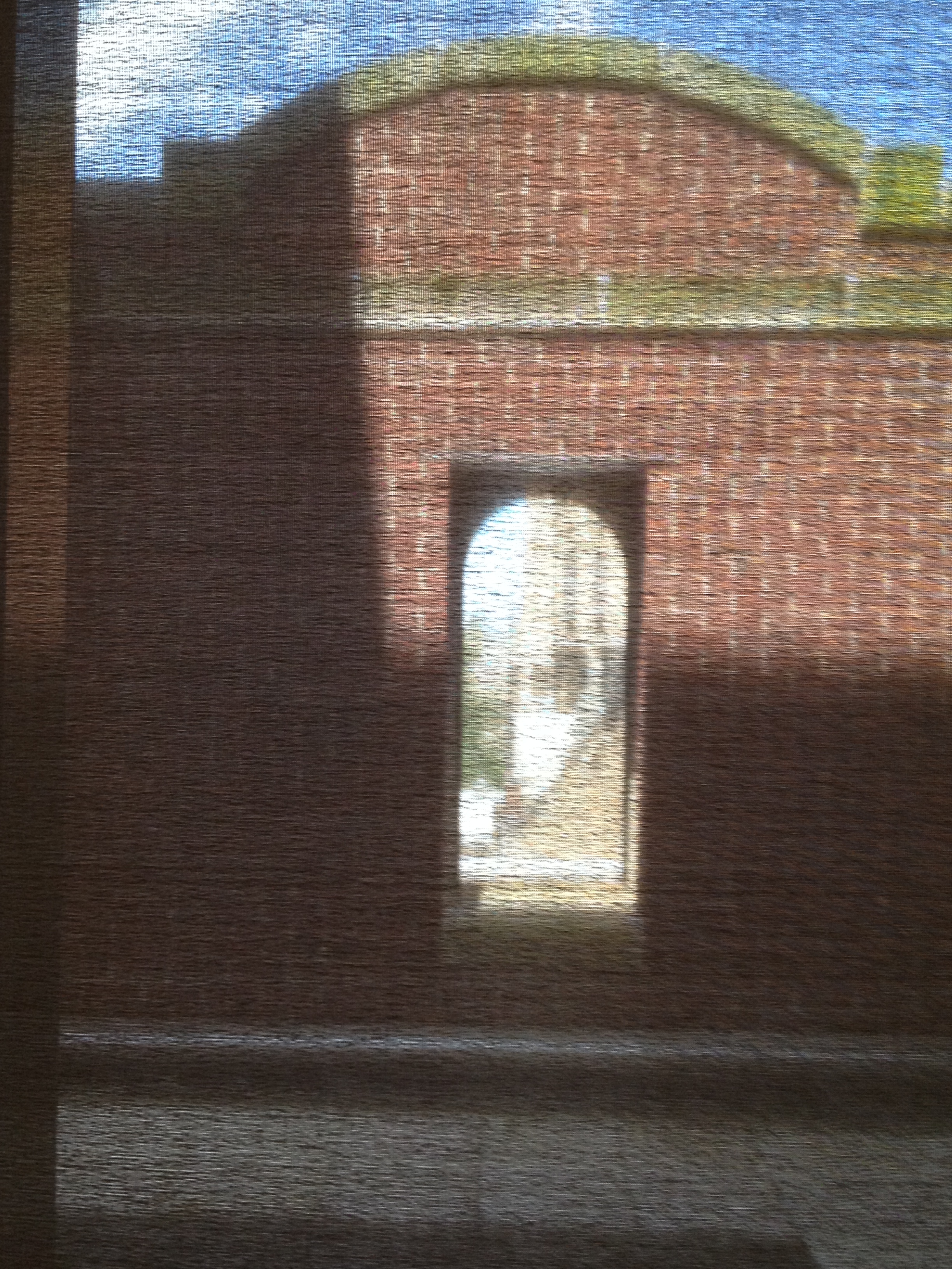
view through a scrim
The new structure unites three important buildings: the collegiate Gothic Street Hall (1866), Italianesque Old Yale Art Gallery (1928) and the modern Louis Kahn museum (1953). Ennead Architects wove these disparate spaces together, creating five long floors plus a couple of mezzanines of gallery space. Initially, the arrangement is slightly confusing; very quickly the logic of the arrangement becomes clear while old stairways, mullioned windows and glass walls offer entrancing glimpses to the sky, adjacent architecture and galleries on other levels.
Meanwhile that light that cleanses the eye and mind at the top seems to illumine even the darkest corners where ancient paintings and fragile materials are protected in shadows.
Then there is the color on walls. In the galleries devoted to Gothic and very early Renaissance, the walls are “mulberry,” a color that initially appears to be black but against the gold-leaf, scarlets and ultramarines, takes on a middle-of-the-night purple atmosphere. Whatever the illumination is, it is cold and clear, not murky and yellow. As the eras move toward the modern, the walls lighten to a cerebral gray for the 18th century and beyond. Asian art—to which I gave sadly only a glance—is cradled in the textured tones of the earth: stony tans, sandy grays, wood, cloud and water.
If only the labels were as engaged with the art as is the setting. Yale University Art Gallery, despite its embrace of education and belief in learning that goes on in galleries, writes labels that conjure the specters of dour blue-haired ladies and tobacco-redolent gentlemen in frayed tweeds who drone on about the art, iterating names, dates, and movements, and never actually look at the objects. Why does the couple in that pair of Hals portraits hold gloves in their hands? What could it mean that Picasso’s artist squiggles with his paintbrush as he anxiously jiggles his foot? Do Stuart Davis’s words, his “traffic signs,” guide us to his “DRAWING?”
Must go back and think more about this.
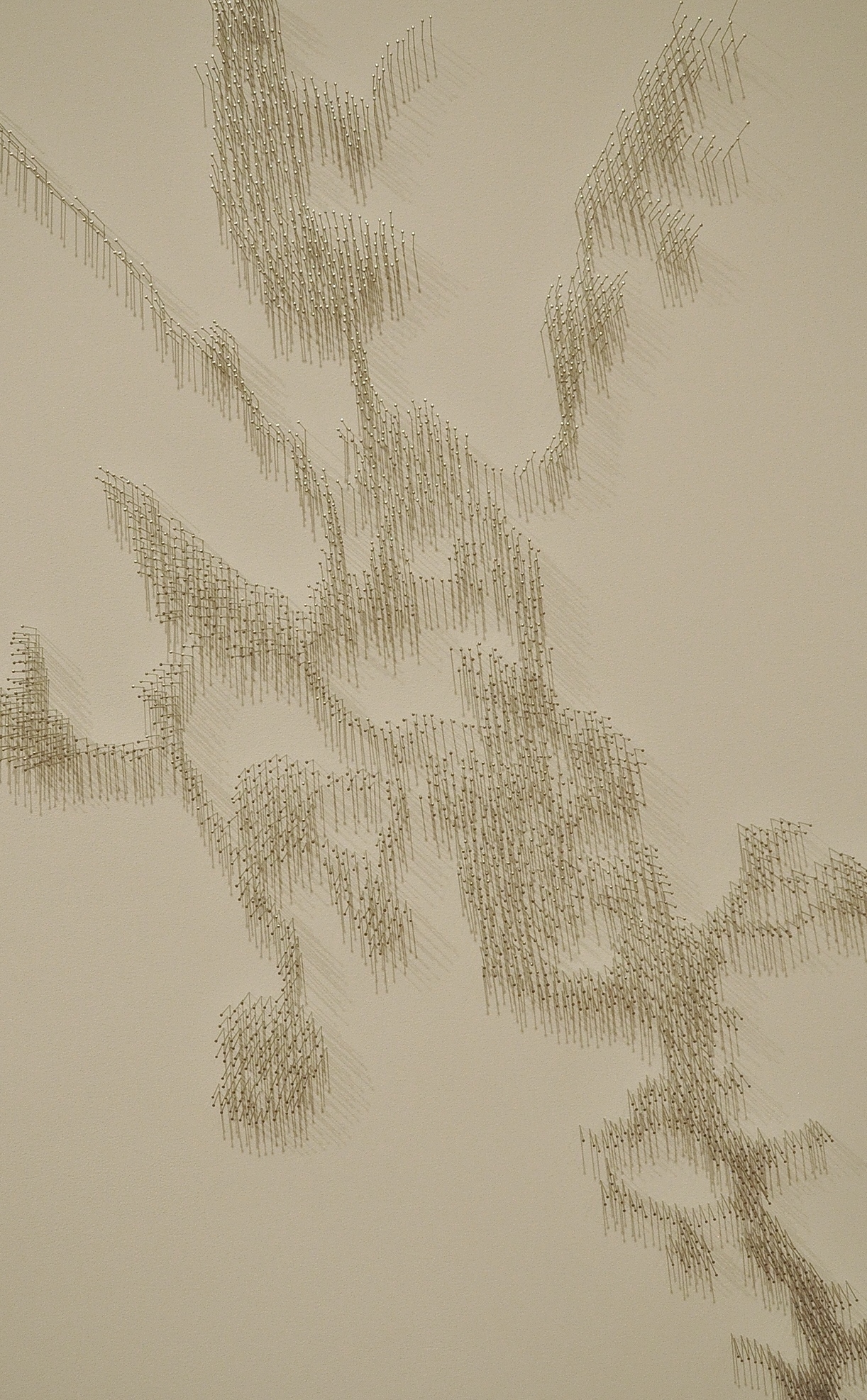
Pin River
Waterville, Maine, is north of the state’s capital, Augusta, and Colby College on the Summer Solstice Friday feels monastic in its quiet emptiness. The Museum of Art is cubes of glass and stone, a series of linked spaces of different vintages and characters. It is primarily a museum of American art, the legacy and largesse of worthy alumni and the ongoing beneficiary of the Alex Katz Foundation.
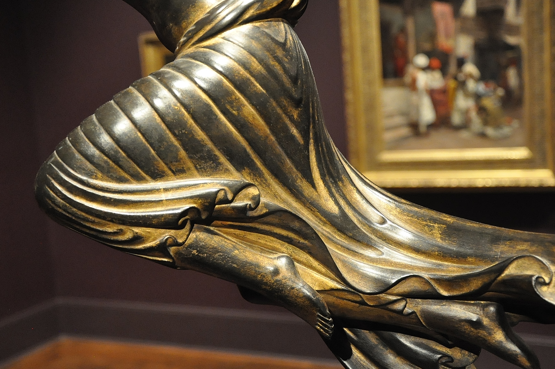
Art for Art’s Sake
Many galleries were closed for installation—the rest were hung with pieces from the extraordinary gift of the Lunder Collection. Other reasons to come back? Works from the John Marin Foundation; paintings from the Alex Katz Foundation; art from the Bernard Langlais Collection.
Yet the labels were only so-so. Traditional works—art with imagery, iconography, narrative, some element of naturalism—sported labels that demonstrated the writer’s comfort in describing them. Contemporary work, especially abstract and more conceptual art, not so much. The writer(s) resorted to “artspeak,” statements so vague as to apply to nearly anything. If I could have edited, I would have.
The Bowdoin College Art Museum, once reached via steps guarded by lions, has taken a cue from the Louvre—now entry is gained through a small glass pavilion isolated to one side of the domed building by Charles Follen McKim of McKim, Mead and White. The 2007 expansion, the work of Machado and Silvetti Associates of Boston, is both conservative and imaginative; the original structure retains its Beaux-Arts elegance well suited to the collections of 18th and 19th century American portraits and decorative arts, European art, and antiquities. The new galleries underground are responsive to the varieties of contemporary art.
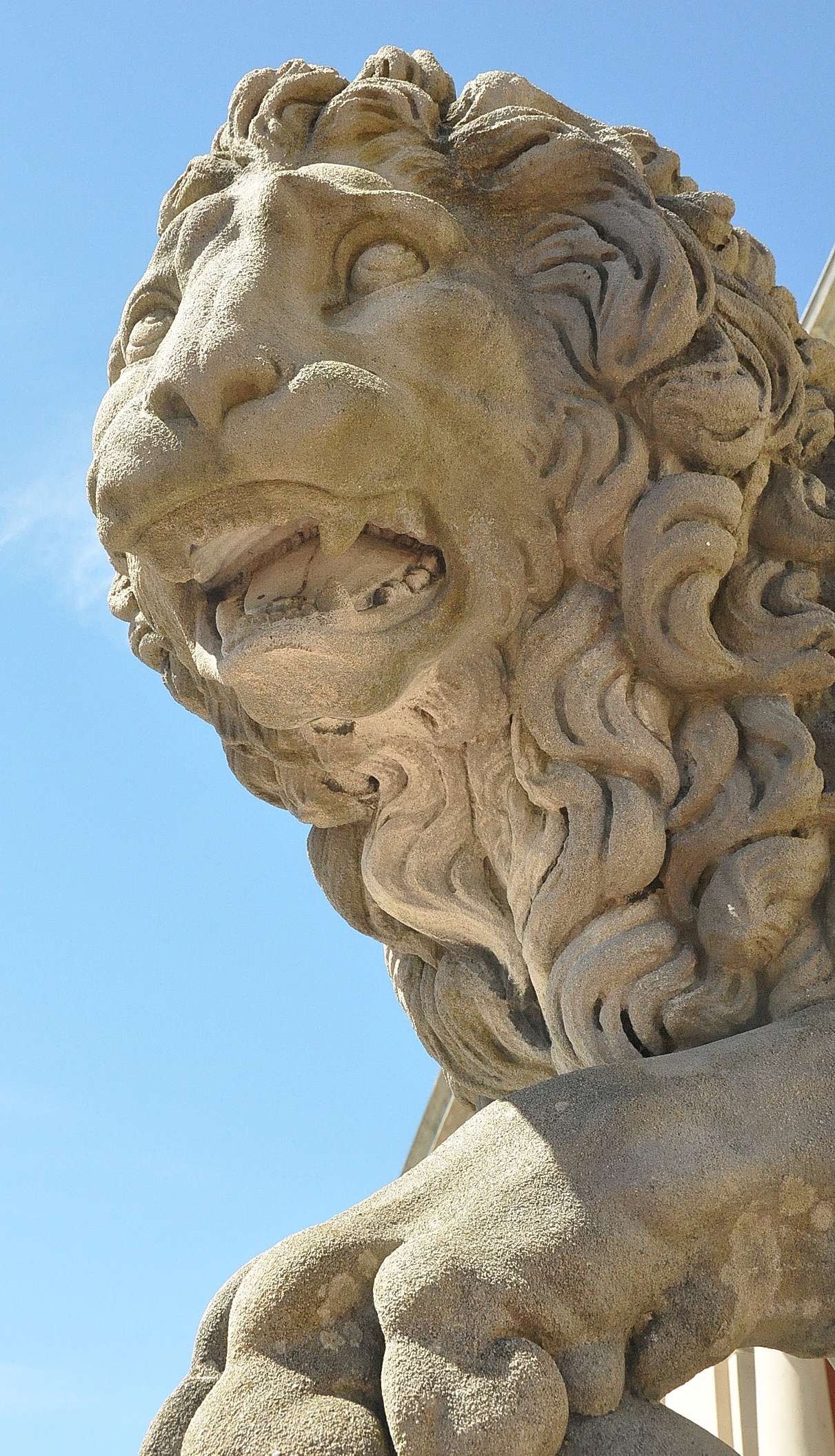
Bowdoin’s lion
But the labels? Some good, some not so good. A big problem for me—and a problem I seem to encounter often—is a matter of font style and color choices. At the top of a stairwell, a fragment from the Palace of Ashurbanipal was mounted on a teal green wall on which the whole relief figure had been diagrammed; an adjacent text explained more about the work and its history. The text, however, was in a light gray that contrasted only slightly with the green background. Hard on these old eyes. In the nearby rooms, the contrast was satisfactory—cream text on dark-colored backgrounds—but the font was a serif style that was no doubt intended to look “colonial” and the fussiness created all kinds of optical blur of the kind one associates with Op Art of the sixties and seventies. And once again, when the writers had to offer comments about abstract and contemporary art, they keep reaching to things they know about the artist, style or historic moment and never really invited the viewer to look at the works, notice things, think about what they notice.
One of the problems of the museum set in the Ivory Tower is the intellectuality that wraps around the art like ivy on the walls of academe. All of them want to make the museum a place of learning; most of them still see “learning” as the transmission of approved information from the authority to the learner; few ask the question of what the student can teach the teacher.