
A painter I know, Gary Horn, recently reminded me of a traditional issue. “I could never figure out the great divide between artists and historians,” he wrote. “…art education could be greatly improved by historians and artists discussing art together in galleries and museums rather than independently in classrooms and studios.”
It certainly could. Teachers, I think, in such settings, would also become more active learners.
Vincent van Gogh
I just read a remarkable bit of description in a letter written by Vincent van Gogh to his brother Theo on 10 October 1885. To be sure, these are the words of the Vincent van Gogh who has not quite yet emerged as a painter. He has not yet become the Vincent van Gogh celebrated for his color palette, mythologized in song and incessantly discussed on Quora.
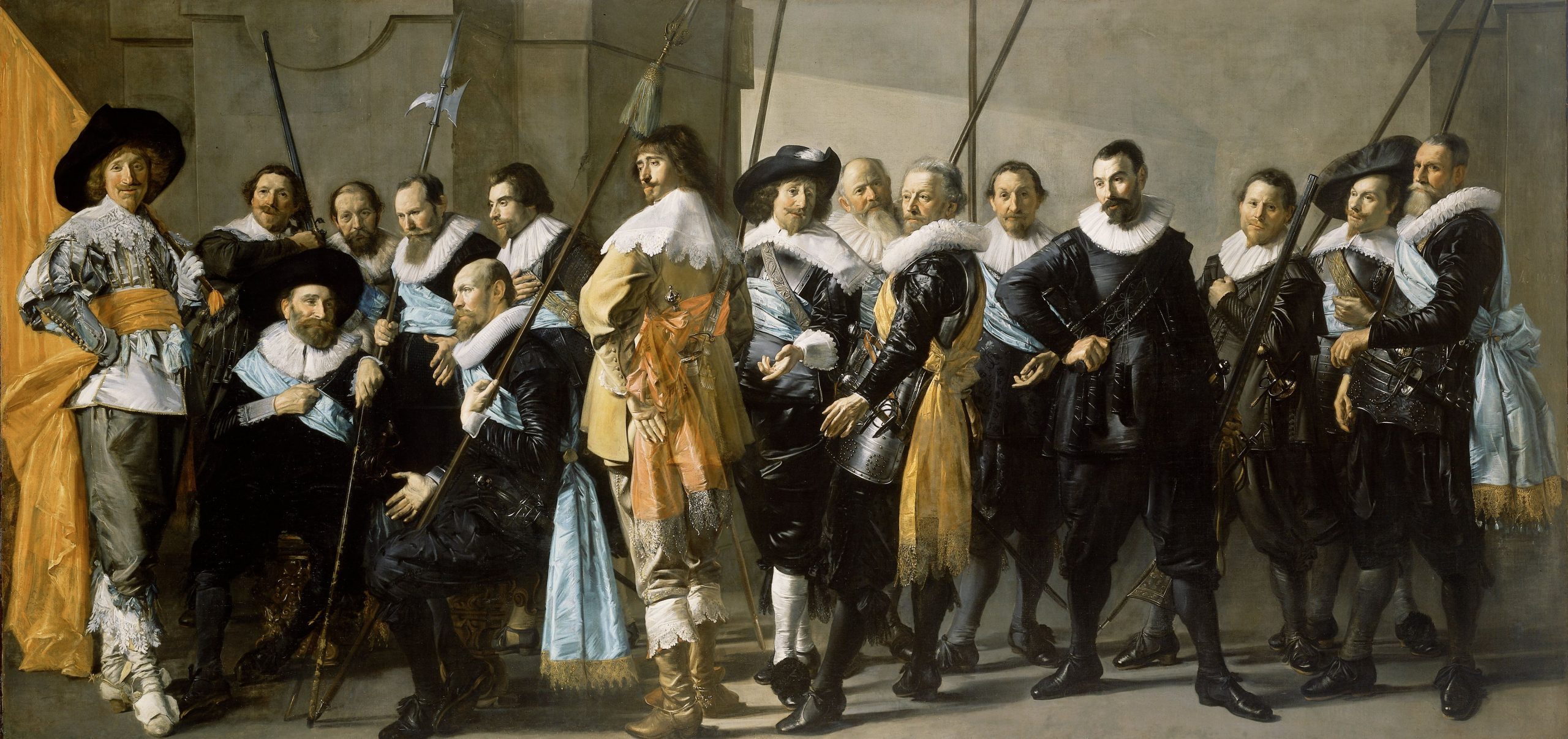
Militia Company of District XI
Vincent was full of excitement about a trip he had just made to Amsterdam and to the Rijksmuseum, overwhelmed by his need to talk about what he had experienced. I can relate. Vincent thrills about Rembrandt’s “Jewish Bride,” and mentions several other paintings. It is, however, the “Militia Company of District XI under the Command of Captain Reynier Reael, Known as ‘The Meagre Company’” (1637) by Frans Hals that captivates him.
Hals’ painting in Vincent’s Words
“There’s a figure in it, the figure of the standard-bearer in the extreme left corner, right up against the frame. That figure is in grey from top to toe, let’s call it pearl grey,–of a singular neutral tone–probably obtained with orange and blue mixed so that they neutralize each other–by varying this basic colour in itself–by making it a little lighter here, a little darker there, the whole figure is as it were painted with one and the same grey. But the leather shoes are a different material from the leggings, which are different from the doublet–expressing different materials, very different in colour from one another, still all one family of grey–but wait!
“Into that grey he now introduces blue and orange–and some white.
“The doublet has satin ribbons of a divine soft blue. Sash and flag orange–a white collar.
“Orange, white blue, as the national colours were then. Orange and blue next to each other, that most glorious spectrum–on a ground of grey judiciously mixed, precisely by uniting just those two, let me call them poles of electricity (in terms of colour, though) so that they obliterate each other, a white against that grey. Further carried through in that painting–other orange spectrums against a different blue, further the most glorious blacks against the most glorious whites–the heads–some twenty–sparkling with spirit and life, and how they’re done! and what color! the superb appearance of all those fellows, full length. But that orange, white, blue chap in the left corner– — …… I’ve seldom seen a more divinely beautiful figures– — it’s something marvelous.
“Delacroix would have adored it–just adored it to the utmost.”
My Art Historian’s Take
What I wished immediately was that I could take this passage, and an image of the painting, into the classroom. So many of my students would beg for examples or good critical analysis; here was the most wonderful example. It eloquently conveys the subject and composition of Hals’ 17th century group portrait. It also plunges into exuberant discussion of the color harmonies that within a year or two would consume Vincent himself.
But I am an art historian and a teacher. Gary is a painter. His response resonated with mine but the painting inspired him to think about something quite different.
An Artist’s Take
Gary responded with, “…the excerpt is a good description of his complex use of the complements…Whistler would have enjoyed this painting as well. The orange reminds me of the combination of burnt sienna and Indian yellow….. but yes…this is a road map of Van Gogh’s use of complementary colors…blue/orange and Black/white with a complexity of greys formed by the complements…a simple way to harmonize the color in a painting…. On a different note…..by seeing a retrospective of El Greco I learned how to use burnt sienna as both an isolating medium and as an underpainting color. it adds fire at the seams separating objects and burns through most of the local colors on the surface.”

The Vision of St John (fragment)
Now I am wondering what color Hals likely laid down before he created such harmonies of blue and orange, white and black. And I need to go back and study El Greco. I pulled up a bunch of El Greco’s on my computer and as much as I look for those seams and undertones of burnt sienna, they are evident just barely when the image is greatly enlarged. I can sense it in his painting he shared. It’s different in front of the real thing.
America: Love It or Leave It Fix It
A Fantasy of Doing It Right
Just imagine, though, building an entire course around the collections of a fairly good museum, and replacing lecture-hall presentations with gallery conversations that draw on different backgrounds, different interests, different ways of seeing, but shared values. What would students really learn from that?